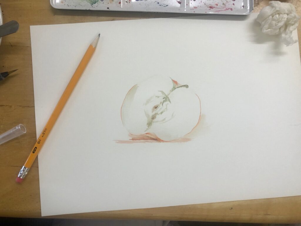
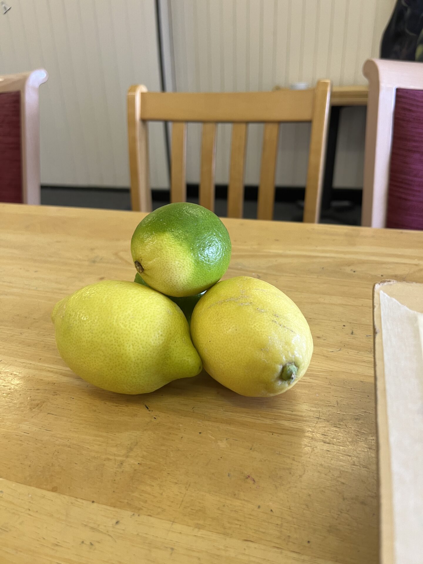
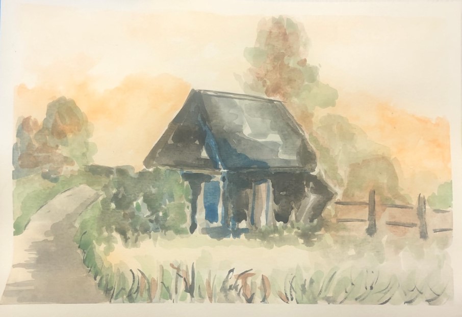
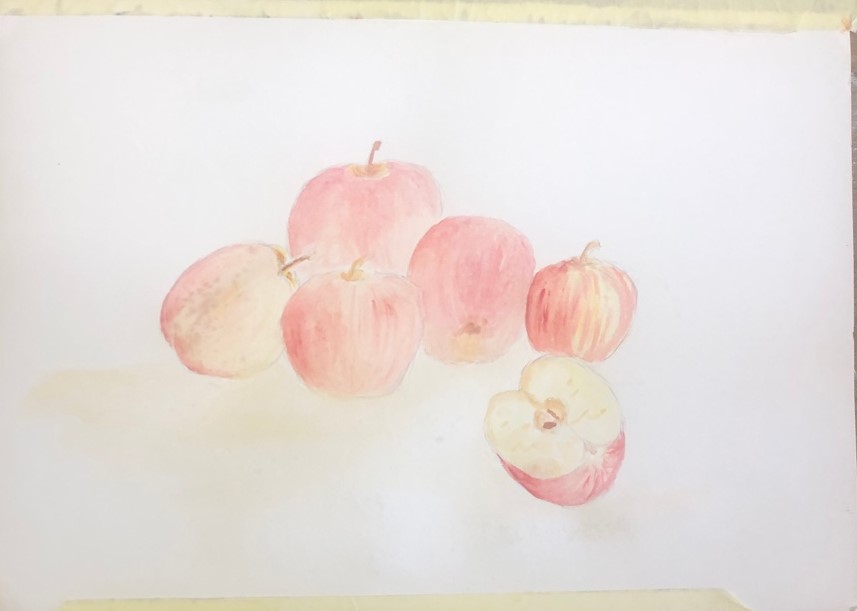
We carried on with our study of water colours, looking at still life, based around fruits ( including peppers). First pictures were of a single fruit then groups of one type of fruit. We also looked at cut fruits, revealing the inside.
As always, I was amazed at how well everyone came to terms with the discipline of this difficult material.
A bit too much drawing for my liking in certain cases .... no names mentioned but we know who you are, Mavis! Excellent results though!
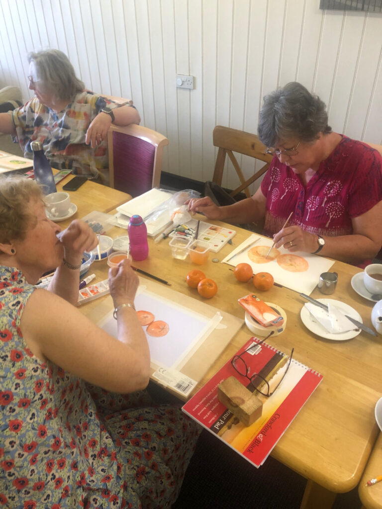
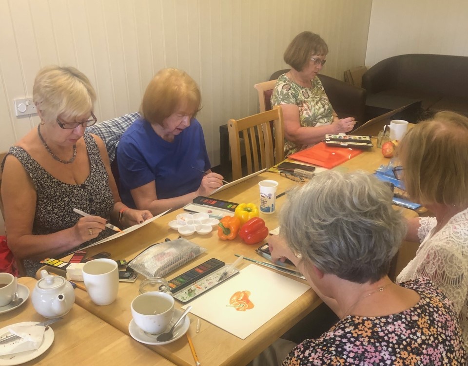
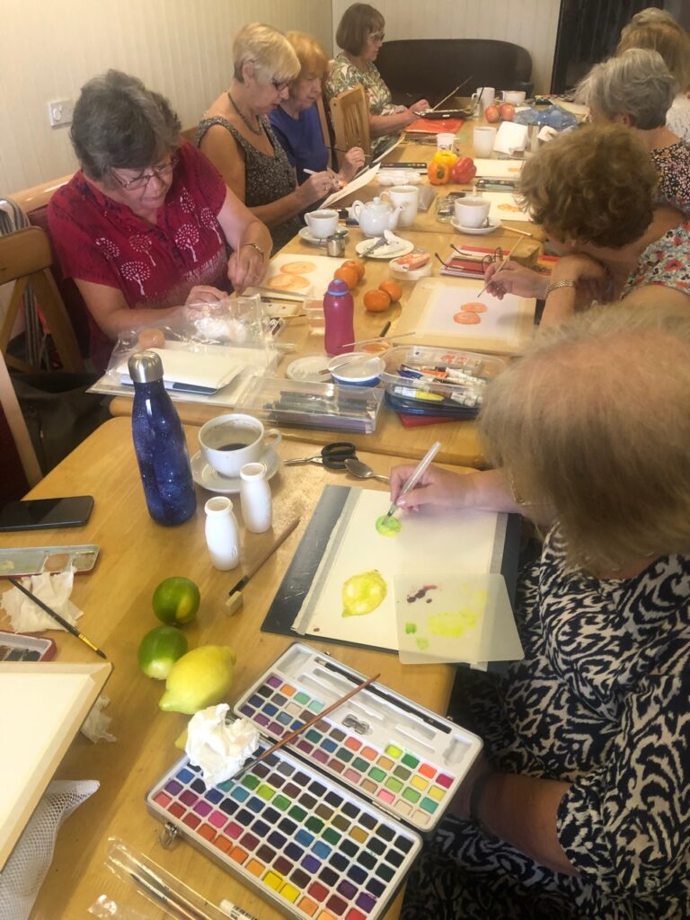
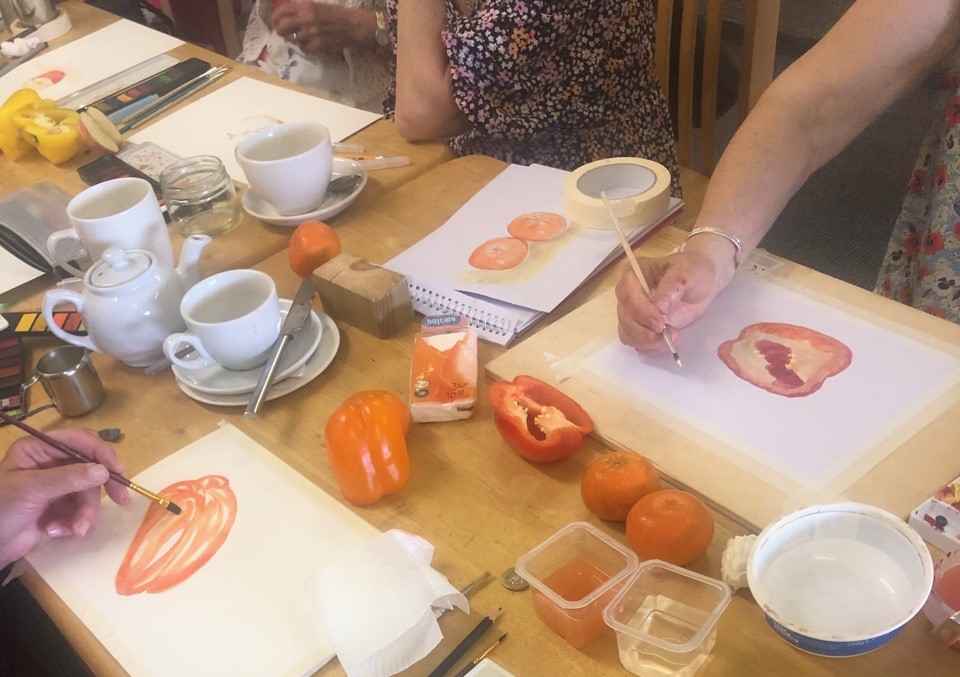
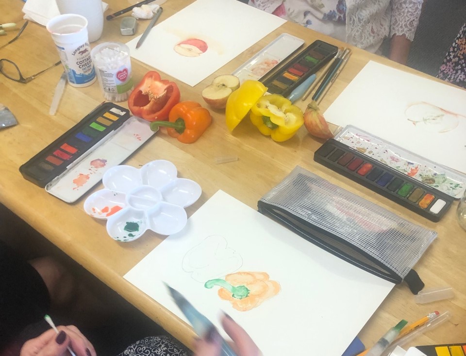
I am now away until September so I expect when I return everyone will have moved forward even more! So here are the things I want you to consider:-
- Let the water colour do its stuff! Wet the paper where you want the colour to move and have your paper tilted.
- Remember that all works need something dark, something light and something in between.
- Don't use black! It absolutely flattens a picture. There is a colour called Payne's Grey, which if you feel you must, you can use. However, the best way to create darkness and shadows, is by using the complementary colour - as when Monet used green for his shadow areas!
- Red yellow and blue are the primary colours. The complimentary colours are those that are left when you remove one .... so the complementary of red is green, of blue is orange and of yellow is purple. These will give you harmonious darks in your picture.
- If it looks like an oil painting you are using TOO MUCH! Less paint!
- Remember that the watercolour police are on holiday so you are free to have a go .... try things, set up a still life, paint outside your window, do a self portrait ..... but have a bash!
- Best wishes and I look forward to seeing you in September!
P xx